Although I’ve done
three samples at this point, I’m by no means a uBiome expert, but hopefully the following guide will be useful to others who are trying to understand their own results better.
After your uBiome sample has been submitted and processed, you will be given access to a private web page with some basic web tools to help you understand your results, but the tools are still under development and you may find them hard to interpret. You also can’t do A/B comparisons of your sample to others, or to your own samples over time, so at some point you’ll need the raw data, which fortunately is easy to get. Log in at http://beta.ubiome.com, then browse your way to a screen where you’ll see this on the left side:
When you select “Raw Taxonomy”, you’ll go to a page with a bunch of apparently garbled noise like this:
That’s the raw data. Now go to my
uBiome site on Github for more instructions and tools to turn that mess into a CSV file, which you can open in Excel. If that’s too much trouble, an alternative is to simply select-all the information on that page, and then copy/paste it into
https://json-csv.com
Once you open that CSV file in Excel, you are home free, thanks to the many, easy built-in analysis tools there. For example, here are the first few rows of my June 2014 sample:
Next you need to understand a few column labels:
- count: the actual number of organisms found in the sample.
- count_norm: a “normalized” version of the count, which you can think of as a percentage. It appears to be a number that uBiome assigned based on the other data they’ve accumulated from other people over the years. I don’t know, but it doesn’t seem to be an industry-standard benchmark. Anyway, you can think of it as 1 / 10,000th of a percent, so in the sample above my level of Firmucutes would be 62.2877%.
- tax_name: this is the classification of the organism, based on the level of its taxonomy. Generally, we think of an organism in terms of species (e.g. homo sapiens), but each organism belongs to other, bigger clusters. For example, humans are members of the class mammalia, along with tigers and horses. If this spreadsheet were counting organisms at the level of class mammalia, the count_norm would almost certainly be bigger than the count_norm for humans alone, unless humans were the only type of mammal found in the sample. Make sense?
- tax_rank: tells which level of taxonomy is represented by this row. You’ll need to know a tiny bit of botany to understand this, which I’ll explain more below, but for now just note that some of the counts will appear duplicated unless you take this into account.
- taxon and parent: these help identify the ranking in a more precise way by pointing out which tax_ranks are subsets of which. For example, Bacteroidia above has a parent = 976, meaning that it is a subset of the taxon 976, Bacteroidetes. When you follow the various taxons and parents up the chain, you’ll see they all end in the superkingdom Bacteria, which has a taxon of 2. I have no idea why they assign the parent of Bacteria the number 131567, but don’t worry: it doesn’t matter.
- tax_color doesn’t matter for this anaysis, but it appears to be how the uBiome software colorizes their pretty graphs to make them more readable.
Now for the botany. The science of Taxonomy (worked out first by Carl Linnaeus in the 1700s), divides all life into seven major categories (ranks): Kingdom, Phylum, Class, Order, Family, Genus, Species (which I was taught in sixth grade to remember by the mnemonic “King Philip Came Over for Girl Scouts”). When you analyze a uBiome sample, you cannot mix and match these ranks. If you talk about species, for example, you must compare the counts to other species — never with a different taxonomic rank.
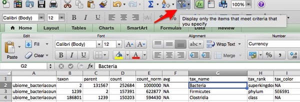
With that out of the way, the next thing is to tell Excel to apply a filter to the whole sheet. In Mac Excel, I just select the filter icon like this:
The first row is transformed into a nifty filtering device. Note how the right side of each cell has a little upside down triangle. Select that and a new pop-up menu will appear that lets you sort and filter the column however you like. Here’s what it looks like when I look just at the tax_rank = phylum, and sort the count_norm in descending order (I also hid the avg column to simply the image):
The count_norm column now corresponds exactly to the percentage breakdown in the fancy charts on the uBiome site!
Here’s the Excel donut chart I made of the above sample:
See? Same info!
But now that it’s in Excel, you can do much easier analysis than what you get currently on the uBiome site. For example, try selecting tax_rank = species and then sort tax_name alphabetically. Now I can look alphabetically at all the different Bifido species found in my sample:
Easy!
There’s much more to say about uBiome, which I’ll cover in a future post. (Huge shout-out to
Dr. Grace Liu and her
Animal Pharm web site for the tons of information I’m just beginning to pour through — highly recommended).


